Brand
A brand system built for precision.
The Kriov identity is the visual equivalent of its discipline: structural, deliberate and quietly confident. These guidelines define how it should be applied.
Position
Conversion Tracking & Measurement Infrastructure.
Kriov is the technical measurement team behind marketing agencies. The brand exists to signal maturity, technical depth and discretion — never hype, never noise. It should feel like infrastructure: present, reliable, and taken for granted until it stops.
Principles
Four rules govern the system.
01
Signal over decoration
Colour carries meaning, not decoration. The accent is used sparingly — to mark what is live, active or actionable.
02
Infrastructure first
Typography, spacing, hairline rules and the grid do the work before colour does.
03
Precision in everything
The system is geometric and deliberate, from the wordmark's signal nodes to the tabular numerals in technical metadata.
04
Discretion by default
Kriov operates behind agencies. The identity is confident, calm and never loud.
Logo
One lockup. Two contexts.
The Kriov lockup pairs the geometric signal emblem with the wordmark. On light backgrounds use the dark navy lockup; on dark backgrounds use the white lockup. Never recolor, restroke or recombine the elements.
LIGHT CONTEXT — white lockup on brand navy
DARK CONTEXT — navy lockup on paper
EMBLEM — geometric K mark on navy
FAVICON — square mark
WORDMARK — geometric lockup
Clear space
Maintain clear space equal to the height of the signal node on all sides of the lockup.
Minimum size
Do not reproduce the lockup smaller than 24px in height — legibility is non-negotiable.
Do not recolor
Use only the provided navy, white or accent versions. No gradients, no shadows, no drop filters.
Do not recombine
The emblem and wordmark are a single lockup. Never separate, rotate or restructure them.
Application
The identity in use.
The lockup applied to stationery — letterhead and business cards. The system is designed to hold its composure across physical and digital surfaces alike.
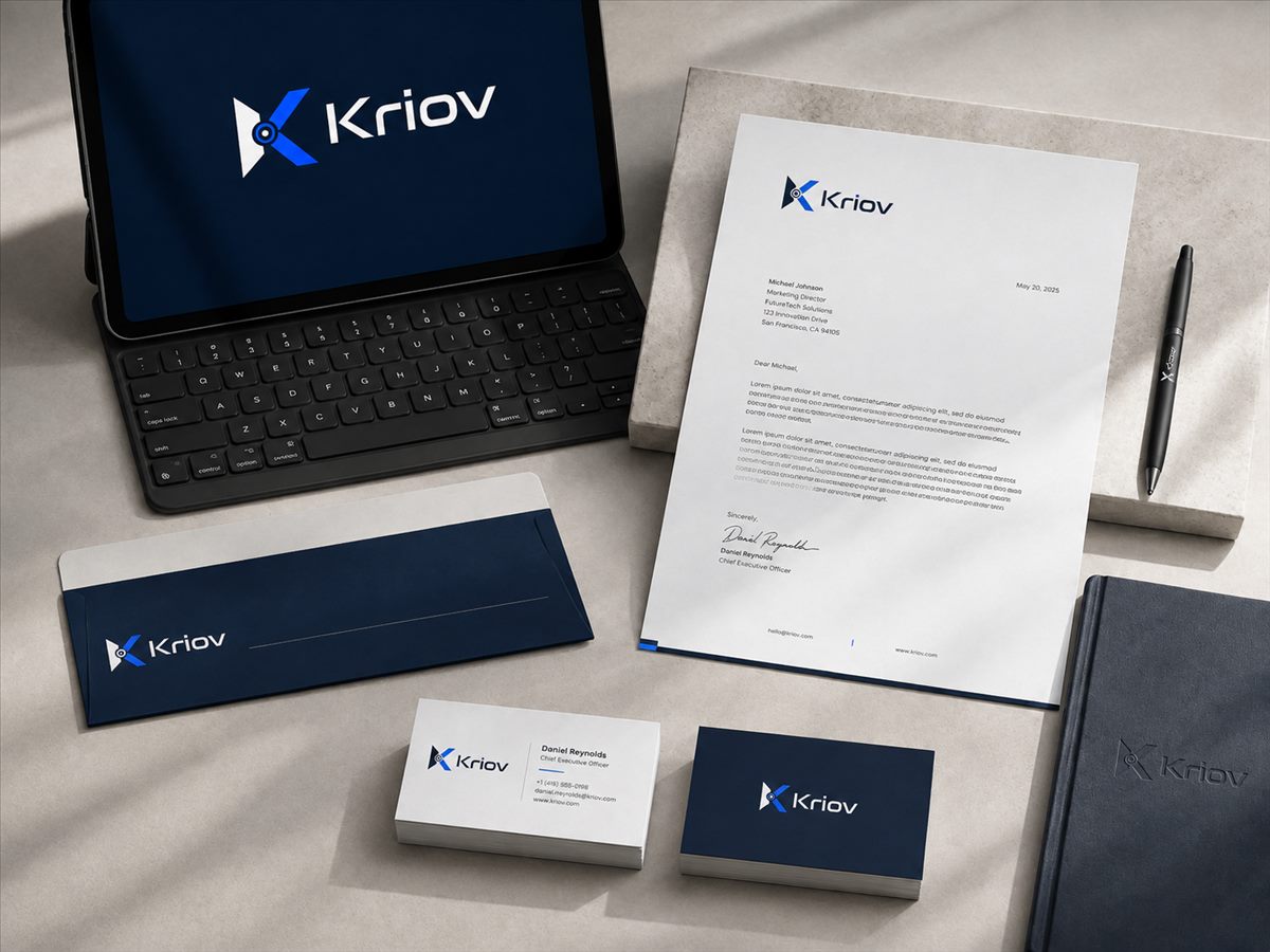
STATIONERY — letterhead & business card application
Colour
The palette carries the system.
Brand Navy
Base · dark sections
#051329
RGB 5 · 19 · 41
Surface Navy
Elevated surfaces
#0A1829
RGB 10 · 24 · 41
Paper
Primary light background
#F4F3EF
RGB 244 · 243 · 239
Ink
Text on light
#101113
RGB 16 · 17 · 19
Signal Accent
Interaction · emphasis
#004FFB
RGB 0 · 79 · 251
The accent blue is the only signal colour. Use it to mark active states, primary actions and live data. Everything else works through typography, spacing and contrast.
Typography
A grotesk system with technical numerals.
Inter Tight
Display · headlines
Tight letter-spacing, editorial weight, strong numerals. Used for headlines and section markers.
Inter
Body · UI
Comfortable line lengths and reliable rendering. Used for copy, forms and interface text.
JetBrains Mono
Technical metadata
Event names, timestamps, parameter values and labels. The typography of measurement.
Downloads
Brand assets and full guidelines.
The complete guidelines document covers usage, clear space, minimum sizes and colour application in full. Files below are provided for approved use.
Use of the Kriov brand assets implies agreement to apply them in accordance with these guidelines.